The unit on experimental design is one of my favorites in the AP Stats year, but the structure of a matched pairs experiment – where every subject participates in both treatments – often confuses students. For the past few years, I have been introducing students to matched pairs design through a sport which is sweeping America…
HALLWAY BOCCE!
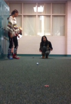 In hallway bocce, students place two poker chips 5 meters apart in the hallway. Then, standing behind one of the chips, they roll a golf ball towards the opposite chip, trying to get as close as possible. With our carpeted hallways, the golf balls really take off, so some practice is needed to get the right touch. During this practice session, the students don’t know where this is all heading in terms of experimental design.
Next, the students are given a direction sheet for recording results. Each “stat-lete” is asked to play bocce 4 times, twice with their right hand, twice with their left, alternating hands. A coin is used to determine which hand to start with. Partners then measure their attempts and record results. Note that today was “fashion disaster” day as part of our school’s spirit week.

Back in class, we then think about what could be conjectured before this experiment. Sure, we could compare the attempts by right hands and by left hands, but what does this tell us? We then settled on looking at players’ dominant versus their non-dominant hands, and made a dotplot of the results (note – my pre-made scale really was not sufficient here…those golf balls really fly!)

But this only allows us to compare hands in general. What we’d like to be able to do is determine if players are better with their dominant, rather than their non-dominant, hands. Subtracting these results, since all players participated in both treatments, allows for this comparison.
 In the end, those reasults seem quite inconclusive, but that’s okay! Not all experiments prove conjectures, and we learn about the process.

5 replies on “Class Opener – Day 54 – Matched-Pairs in AP Stats”
This is part of our curriculum in NZ. Have you considered drawing arrow graphs to analyse the results? The problem with the dot plots is that it is easy to lose the identity of each individual in the experiment. Have a look here: http://new.censusatschool.org.nz/resources/2-10/
thanks for sharing. What do you mean by an arrow graph? Maybe I know it as something else. Fascinating that it is part of NZ curriulum – will share with others here.
An arrow graph.
Each experimental unit has two data values in a before and after experiment.
Eg distance rolled on carpet (4m) and distance rolled on floor (6.5m)
Draw a vertical scale encompassing all the possible data values for before and after.
Place the before measurements in one column, and the after measurements in a column to the right. Link each pair with an arrow from before to after.
By looking at the arrows you can see all sorts of things…how many increase, how many decrease. What is the variation in steepness….etc, and you don’t lose the identity of each experimental unit.
If you have an email address I can send you an example.
Have a look here
http://students.mathsnz.com/nzgrapher/by-graph-type/2-drawing-dot-plots/part-2-4-paired-experimental-data
got it. That’s a interesting approach…have not seen that used around here before. Definite benefit to seeing how the pairs relate. Thanks again for sharing.