Categories
High School Technology

Animations Using Parametric Curves

This past semester I added a fresh coat of paint to a unit on parametric equations by challenging students to develop their own animations on Desmos. For many years I have used a Desmos activity to introduce the idea of time as a parameter within equations – https://teacher.desmos.com/activitybuilder/custom/576ed1058e03e695283c88b8 – and Desmos invites students to think about the role of time by inserting the idea into ordered pairs easily. Here’s how I introduced the idea. If you get lost or want to look under the hood, here is the final Desmos graph I share with students as a resource: https://www.desmos.com/calculator/7zuubmunhl

STEP 1: Develop Your Vision

Before we dive into Desmos, think about what you want to animate and the path you want it to take. For this demo I have a vision of a ball starting in quadrant 3 and following 3 linear paths until the end in quadrant 1. Sketching out the vision is helpful:

The animation here has 3 linear phases – see the points below, and you can certainly allow for non-linear paths as well. There are a few things for students to attend to here: how the coefficients of t allow for movement, and notice how (t-7) and (t-10) are used in the second and third points in order to “trigger” the animations at the right time, matching the domain of t given for each of the points. Take time to build this with students. Define the second point to begin when the path of the first ends, then include the parameter t.

Allow students to interact with the points and alter them to their liking. Or have students develop their own paths.

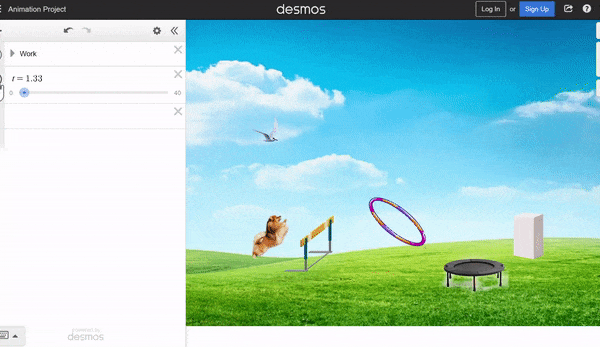
STEP 2: Introduce an Image

Next, find an image you would like to animate. I used a soccer ball here, and added a cute sun in the sky later. Upload the image to Desmos, and drag the corners to adjust the size of the image.

Now, a little heavy lifting with Desmos. Students will need to attend to precision and symbols here – encourage students to work together to follow the steps and syntax.

The goal is to replace the center of the image with a conditional statement using the 3 paths we defined earlier. The center I used with my soccer ball is shown below, and note the structure: for each path, start by stating a period for t, followed by the parametric point, separated by a colon. Then, a comma will separate each of the 3 stages.

It’s helpful to share the graph with students so they can dissect the command and make sure the syntax they are using is working.

Defining the center in this manner will then invite us to create a slider for t, which we will do here. Click the endpoints of the slider to define the start and end of the time period you would like. Then play and let the oohs and aahs wash over the room.

STEP 3: Explore the Space

Now it’s time for students to build their own creations. As students build, they may become inspired to investigate new ideas. In my class, some things which came up are:

  • Non-linear paths: these can be defined within the points
  • Rotations: t can be used to define the angle of an image
  • Image dilations and appearances: the slider for t can also be used to define the height and width of an image, as well as the opactity
  • Backgrounds: students can find a general image to serve as a background. I encouraged students to lower the opactity of and background image so that the animation pops on the screen.

STEP 4: Gallery Walks

Allow students to share their creations with each other half-way through the project and ask questions about procedures. In tech-based lessons, students are often their best resource, and inspiration for a new idea can come from each other. Here are a few student creations from this first project attempt.

Categories
Statistics Technology

Adapting to Remote Learning – Egg Roulette

This is the first in what will likely be a series of posts about classroom moves which I have adapted for remote learning. I hope you enjoy them!

In my freshman-year Prob/Stat course, students experience a probability lesson featuring the game “Egg Roulette”, based on a bit from Jimmy Fallon’s Tonight Show. Here is a summary of the “live” lesson: https://mathcoachblog.com/2015/09/20/an-egg-cellent-simulation/. This year, there were two considerations for how I would have students investigate the game: conducting the simulation and collecting the results.

CONDUCTING THE SIMULATION

The first class simulation involves two unsuspecting volunteers and my actual container of 12 “eggs” – filled with little fuzzballs. Click the link in the last paragraph to see a video of how it works. In the main simulation, students use decks of cards to play the game repeatedly. Give pairs of students 13 cards all of the same suit. Discard the ace. Then, the 10, jack, queen and king represent “raw” eggs. The other cards represent the “hard-boiled” eggs. In a remote environment I could have used a site like random.org to draw cards, but I also saw an opportunity to build a simulation students could use to quickly analyze repeatedly. This Desmos link allows students to play the many times: https://www.desmos.com/calculator/2b7f6p4r3o. Click the “rerandomize” button to generate repeated plays of the game. Online, we talked through a few of the simulations and I found the students quickly understood the format.

Jimmy Fallon Egg Roulette simulation on Desmos

COLLECTING THE RESULTS

I have used a number of methods for collecting class results over the year: sticky dots on a poster, Post-It Notes on a wall, digital data collection. Clearly this year we had to go digital, and the site http://stapplet.com came to the rescue. New this year, teachers have a “collaborative” option – this feature generates a class code from which students can submit their data to the class (thanks Josh Tabor and Luke Wilcox!). The results update in real time. Each student then pasted the class graph into OneNote and a discussion of Jimmy Fallon’s “meanness” – is he being nice to his guests by letting them draw first? – followed.

Results of our class simulation using stapplet

The rest of the lesson and discussion felt similar to previous years. I challenge small groups to find the probability of a player losing in round 3. This leads us to probability ideas of independence / dependence and the multiplication rule. The engagement remained high and the conversation was on par with previous years!

Categories
Statistics Technology

Let’s Explore the Activity Builder Space

Today our friends at Desmos released an update of their Activity Builder editor. You can head to teacher.desmos.com now and explore the changes – edit a previous activity, create a new one OR copy screens from activities in the library of Desmos activities.

The first thing I noticed about the updated editor was the increased freedom in screen design. Previously, elements like Graph, Note and Input were limited in their placement and number. There is more freedom now to move elements around, order them as you like, and include more of them in a single screen.

Immediately I wanted to explore this new freedom and think about intentionality in my design process for an activity I wrote and used in my AP Stats class this spring – Is My Die Fair. In this activity students “roll” both a virtual hand-made die and a virtual real die. The activity allows students to discover the chi-squared statistic as a reasonable measure of variability in a categorical distribution. Here are two ways I changed this activity with the new editor, with the intent that students will be able to follow the narrative with less arrowing through the activity.

ORIGINAL VERSION:

Screen 2: students roll the hand-made die 60 times

Screen 3: results are copied from screen 2 and students make observations.

NEW VERSION:

Students roll the die AND make a conjecture on the same screen.

Another place I was able to leverage the new block placement freedom occurred later when students begin to think about the computation of the chi-squared statistic.

ORIGINAL VERSION:

Screen 8: the new statistic is explained, and students complete a table for the homemade die only.

Screen 9: a summary statistic is shown, and students now complete the table for the real die.

Screen 10: both summary statistics are shown and students make a final conjecture about the dice.

NEW VERSION:

Screen 7: the new statistic is explained, and students complete tables for both types of dice on the same screen.

Screen 8: both summary statistics are shown and students make a final conjecture about the dice.

Share your ideas for altering your previous activities to leverage the new design freedoms. Below, you can test-drive both activities and see how I altered them. Your ideas are always appreciated…now get building!

“Is My Die Fair” – original version – https://teacher.desmos.com/activitybuilder/custom/5e713346f6e84e7dd46727fd

“Is My Die Fair” – version 2 –https://teacher.desmos.com/activitybuilder/custom/5ef38c6cad9e310dc0a6ac23