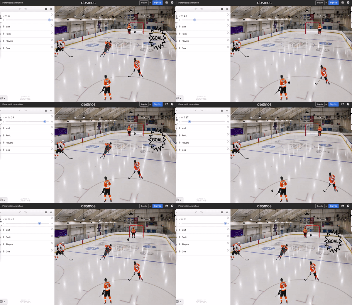
Categories
High School Technology

Animations Using Parametric Curves

This past semester I added a fresh coat of paint to a unit on parametric equations by challenging students to develop their own animations on Desmos. For many years I have used a Desmos activity to introduce the idea of time as a parameter within equations – https://teacher.desmos.com/activitybuilder/custom/576ed1058e03e695283c88b8 – and Desmos invites students to think about the role of time by inserting the idea into ordered pairs easily. Here’s how I introduced the idea. If you get lost or want to look under the hood, here is the final Desmos graph I share with students as a resource: https://www.desmos.com/calculator/7zuubmunhl

STEP 1: Develop Your Vision

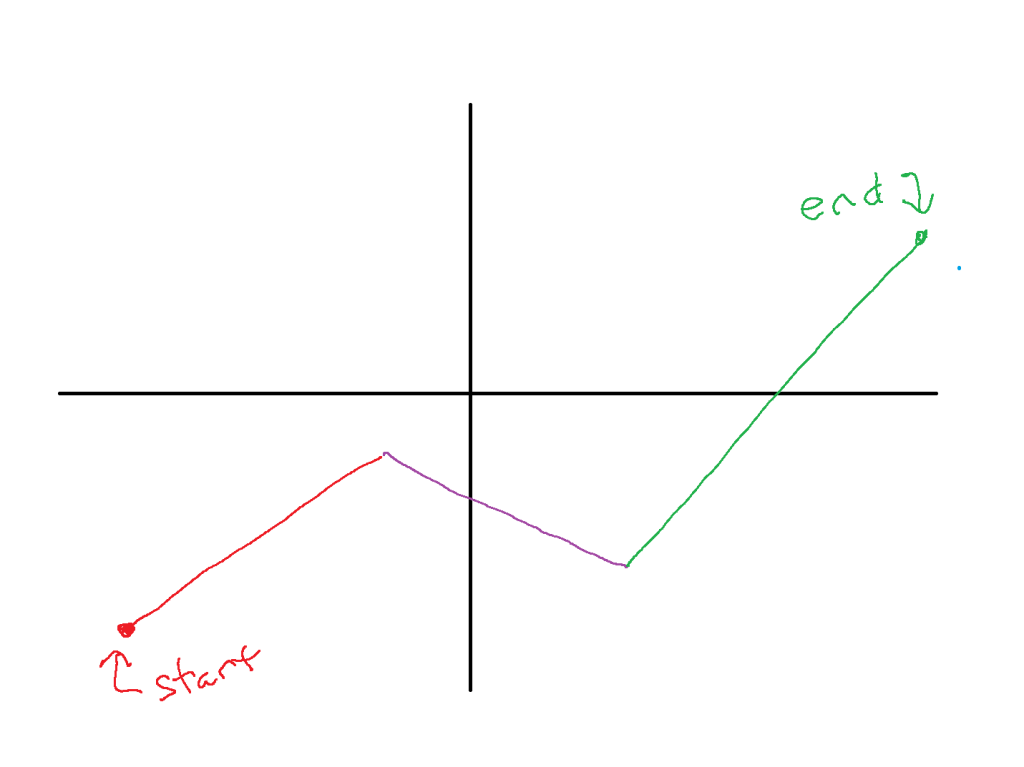
Before we dive into Desmos, think about what you want to animate and the path you want it to take. For this demo I have a vision of a ball starting in quadrant 3 and following 3 linear paths until the end in quadrant 1. Sketching out the vision is helpful:

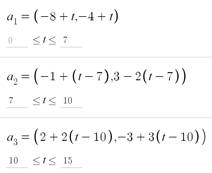
The animation here has 3 linear phases – see the points below, and you can certainly allow for non-linear paths as well. There are a few things for students to attend to here: how the coefficients of t allow for movement, and notice how (t-7) and (t-10) are used in the second and third points in order to “trigger” the animations at the right time, matching the domain of t given for each of the points. Take time to build this with students. Define the second point to begin when the path of the first ends, then include the parameter t.

Allow students to interact with the points and alter them to their liking. Or have students develop their own paths.

STEP 2: Introduce an Image

Next, find an image you would like to animate. I used a soccer ball here, and added a cute sun in the sky later. Upload the image to Desmos, and drag the corners to adjust the size of the image.

Now, a little heavy lifting with Desmos. Students will need to attend to precision and symbols here – encourage students to work together to follow the steps and syntax.

The goal is to replace the center of the image with a conditional statement using the 3 paths we defined earlier. The center I used with my soccer ball is shown below, and note the structure: for each path, start by stating a period for t, followed by the parametric point, separated by a colon. Then, a comma will separate each of the 3 stages.

It’s helpful to share the graph with students so they can dissect the command and make sure the syntax they are using is working.

Defining the center in this manner will then invite us to create a slider for t, which we will do here. Click the endpoints of the slider to define the start and end of the time period you would like. Then play and let the oohs and aahs wash over the room.

STEP 3: Explore the Space

Now it’s time for students to build their own creations. As students build, they may become inspired to investigate new ideas. In my class, some things which came up are:

  • Non-linear paths: these can be defined within the points
  • Rotations: t can be used to define the angle of an image
  • Image dilations and appearances: the slider for t can also be used to define the height and width of an image, as well as the opactity
  • Backgrounds: students can find a general image to serve as a background. I encouraged students to lower the opactity of and background image so that the animation pops on the screen.

STEP 4: Gallery Walks

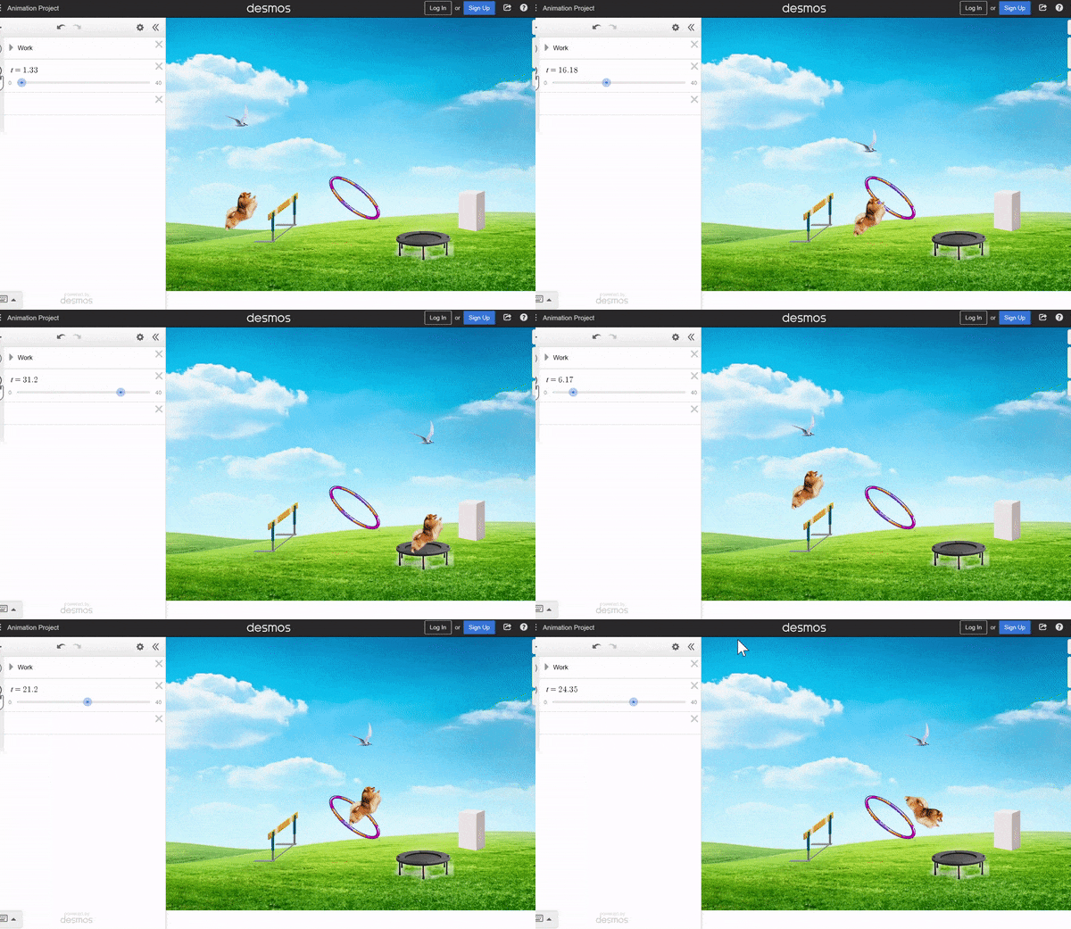
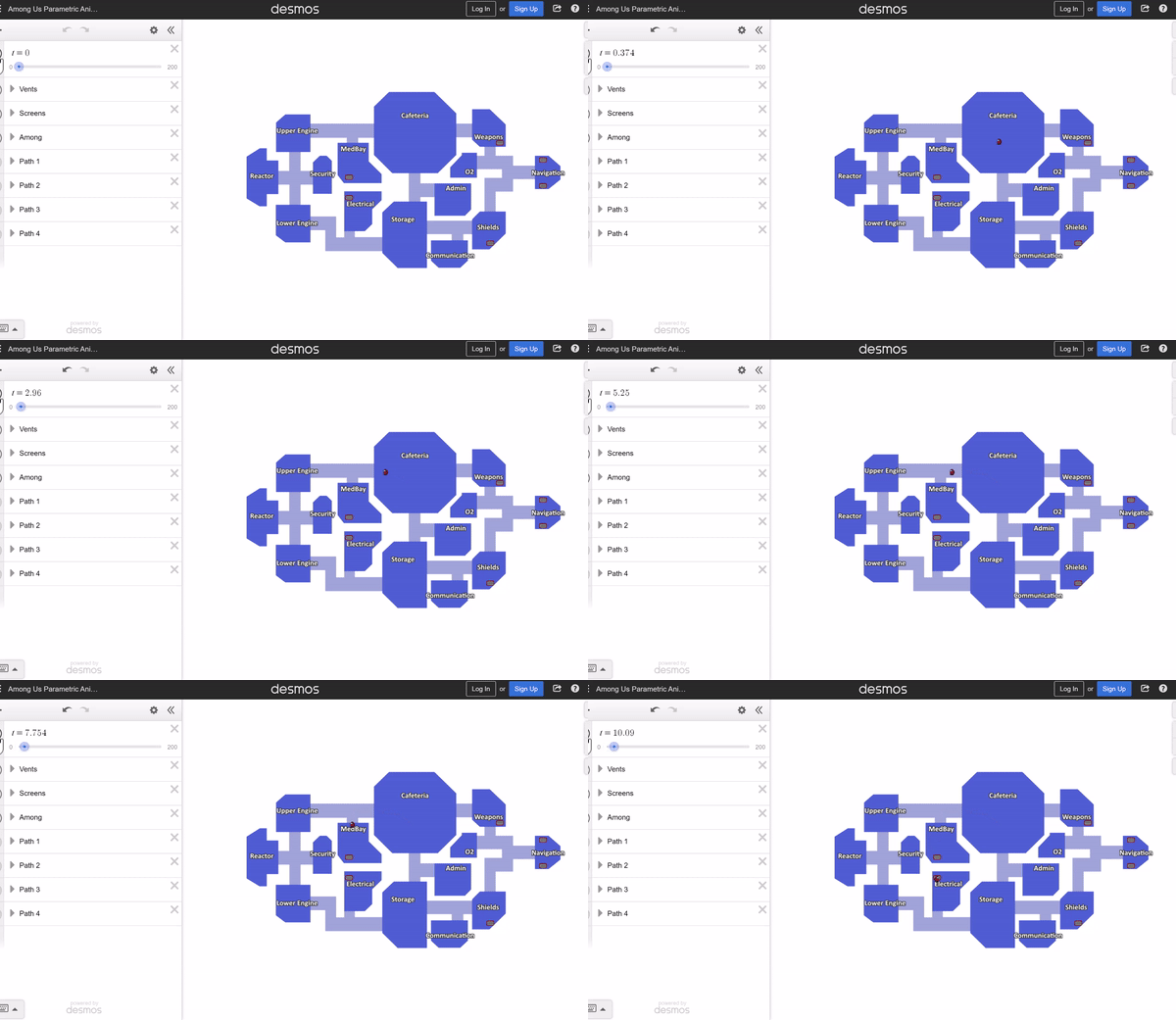
Allow students to share their creations with each other half-way through the project and ask questions about procedures. In tech-based lessons, students are often their best resource, and inspiration for a new idea can come from each other. Here are a few student creations from this first project attempt.
Advertisement
Categories
Statistics

Power and Virtual Coins

This activity was inspired by the article “Innocent Until Proven Guilty”, by Catherine Case and Doug Whitaker. NCTM Mathematics Teacher, Volume 109, Issue 9 (May 2016)

Around February each year, the AP Statistics message boards come alive with new and veteran AP Statistics teachers seeking ideas to help students understand the concept of statistical power. While Power is a “minor league” topic in the AP Stats curriculum, a robust discussion of the concept can help tie together the logic of statistical inference: P-values, error and sampling variability. I’ve developed a few activities to try to bring Power to life (see here and here). And while each was satisfying in their own way, none of them really met one of my overarching classroom goals – to have students identify and express a new idea with their groups before I provide clarification. This year’s activity worked nicely as it allowed students to experience statistical power and generate meaningful conversation. Download the student version below, then read to learn how it works.

In this activity students will investigate the “fairness” of 3 virtual coins through a Desmos graph, using 3 different sample sizes to compile evidence. For each sample, students use their graphing calculator to compute a P-value and then reach a statistical conclusion. For coin A, I led students through the steps for n=10 and encouraged them to work through the next two sample sizes using their group-mates as a support system.

As students completed all three columns for coin A, I asked them to make a final decision regarding the fairness of coin A – is there convincing evidence that coin A is unfair? Students discussed findings with their groups and thoughts about how each column provided convincing evidence. Here is what the class-wide vote and conversation revealed:

  • Of my 42 total students (2 classes), only 1 student concluded that coin A was unfair.
  • All groups agreed that the larger sample size (n=100) was more useful in reaching a decision about the coin.

Spoiler alert: coin A is unfair! If you take a peek under the Desmos hood, you will find that coin A is “programmed” as 48% heads, 52% tails. I didn’t reveal the true proportion until the end, but we are off to a good start here: small differences between the null and “truth” are less likely to be detected.

Groups then tackled coin B with little assistance from me. Working through each column, then the follow-up conversation and decision, took about 5 minutes. This time about 60% of the students concluded that coin B was unfair.

Finally, coin C. Many students quickly concluded that coin C was unfair (it is!) but worked through each of the columns and sample sizes. In the end, there was class-wide agreement that coin C is an unfair coin.

At this point I revealed the truth about each coin:

  • Coin A: 45% heads
  • Coin B: 40% heads
  • Coin C: 25% heads

So, what do our finding show us about hypothesis testing and decision-making as a whole? I was thrilled when one of my students who does not volunteer often raised his hand to offer the following: “If there is a big difference between the null and the truth, it’s easier to reject the null.”

Yes! That’s a big part of power. What else?

Larger sample sizes are more likely to detect a difference when one exists.

Yes! And now we have a nice framework for power. From here I shared a working definition of power and included thoughts on alpha, which are not part of this activity now but could be in a later version.

EmPower your students to develop statistical ideas!

Categories
Statistics Technology

Desmos + Statistics = Happiness

Sunday – a quiet evening before President’s Day – checking out twitter – not looking for trouble – and then,

Wait..what’s this?  Standard Deviation?  It was my birthday this past Saturday, and the Desmos folks knew exactly what to get me as a present.  Abandon all plans, it’s time to play.  A lesson I picked up from Daren Starnes (of The Practice of Statistics fame) is a favorite of mine when looking at scatterplots.  In the past, Fathom had been the tool of choice, but now it’s time to fly with Desmos.  There are a few nuggets from AP Statistics here, and efforts to build conceptual understanding.

CORRELATION, LSRL’S AND STANDARD DEVIATION

Click the icon to the right to open a Desmos document, which contains a table of data from The Practice of Statistics.  In you are playing along at home, this data set comes from page 194 of TPS5e and shows the body mess and resting metabolic rate of 12 adult female subjects. One of the points is “moveable” – find the ghosted point, give it a drag, and observe the change in the LSRL (least-squares regression line) – explore changes and think about what it means to be an “influential” point.

Next, click the “Means” folder to activate it.  Here, we are given a vertical line and horizontal line, representing the means of the explanatory (x) and response (y) variables. Note the intersection of these lines.  Having AP students buy into the importance of the (x-bar, y-bar) point in regression beyond a memorized fact is tricky in this unit.  Drag the point, play, and hopefully we can develop the idea that this landmark point always lies on the LSRL.

Another “fact” from this unit which can easily wind up in the “just memorize it” bin is this formula which brings together slope, correlation, and standard deviation:

The formula is given on the exam, with b1 acting as the slope, so even memorizing it isn’t required, but we can develop a “feel” for the formula by looking at its components.

Click the “Means plus Std Devs” Folder and two new lines appear. we have moved one standard deviation in each direction for the x and y variables. Note that the intersection of these new lines is no longer on the LSRL. But it’s pretty close…seems like there is something going on here.

Ask students to play with the moveable point, and observe how close the rise comes to the intersection point. Can it ever reach the intersection? Can we ever over-shoot it? In the “Rise Over Run” folder, we can then verify that the slope of the LSRL can be found by taking a “rise” of one standard deviation of y, dividing by a “run” of one standard deviation of x, and multiplying by the correlation coefficient, r.


There’s other great stuff happening in the Desmos universe as well.

1.  This summer brings the 4th edition of Twitter Math Camp, to be held at Harvey Mudd College in California. I’m thrilled to have latched onto a team leading a morning session on Desmos. Consider coming out for the free PD event, and join myself, Michael Fenton, Jed Butler, and Glenn Waddell for what promise to be awesome mornings. To be honest, I feel the Ringo of this crew….

2. Can’t make it to the west coast this summer? Join me at the ISTE conference in Philadelphia, where I will present a learning session: “Rethink Math Class with the Desmos Graphing Calculator“. Bring your own device and join in the fun!

3. Are you new to the world of Desmos? Michael Fenton has organized an outstanding series of challenges, with 3 difficulty levels, to help you learn by doing. Try them out – they promise to get you think about how you and your students approach relationships.

4. Merry GIFSmos everybody!  The team at Desmos has developed GIFSmos to let you build your own animated gifs from Desmos files. EDIT – as Eli noted in the comments, credit for GIFSmos goes to Chris Lusto.  Thanks for being so awesome, Chris!