With the inclusion of Desmos as a tool on the digital AP Statistics exam, I have noticed (and responded to) the many questions teachers have about showing work when Desmos is used:
“Do we know anything yet about what Desmos calculator notation will be allowed on the AP Stats exam, similar to the way normalcdf TI notation was allowed?” – via reddit
The short answer here is no…and we won’t know until rubrics for the 2026 exam are released next fall. And while I have some suspicions about how “Desmos speak” could be handled, my first piece of advice is to take a wider view of statistical communication.

I have been involved with the AP Statistics reading since 2012 – as reader, table leader, and now as a table leader working on a rubric team. In the past, labeled calculator speak has been been accepted to earn credit for components of problems – usually calculations of probabilities from normal and binomial distributions – but such labeling demonstrates a low bar for statistical communication. A comment from Corey Andreasen on the AP Stats Facebook group is an exellent summary of this:
To elaborate a bit, calculator syntax was never required, merely tolerated (if labeled) as it does minimally address the necessary components: Identifying the distribution (the word “normal” or a picture of a normal model should appear – normcdf is close enough), parameters (labeled calc syntax does identify mean and sd, but so does a labeled diagram or just listing them), boundary and direction (a shaded and labeled diagram or a proper probability statement does this, but the lower and upper bounds in the calc notation suffice, if labeled). It is better to get students to communicate properly using statistical notation.
PRO-TIP: Encourage students to use standard notation at all times. Place your bar for communication on in-class assessments higher than the AP rubrics.
For example, part a of question 6 from the 2023 exam asks students to find a probability from a normal distribution. The rubric lists 3 components to be met in order to earn full credit. This rubric is typical of similar problems in previous years.
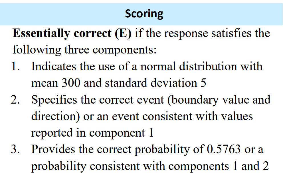
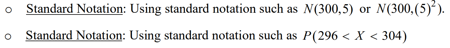
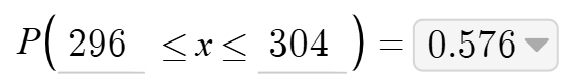
Components 1 and 2 can be met by using standard notation.
On my class assessments, not only do I require students to meet all 3 components, I also require a labeled sketch of the normal distribution and z-score computation. I insist upon the z-score as this will be an important statistic to understand as we start to study inference and compute test statistics.
SO, WHAT ABOUT DESMOS?
The acceptance of calc-speak as evidence for components is listed under the “Notes” section of the rubric.

The notes are developed by the chief reader prior to the AP reading, and notes may be added as sample papers are reviewed in the days leading up to the exam reading. So, any scoring notes involving Desmos would likely come from observations of student work. Here is my suggestion about how Desmos language could be incorporated into an existing rubric:

To receive full credit, students would then need to provide an inequality and a correct answer, which is provided on the calculator screen.
In summary – calc speak…it’s acceptable. But it’s also a great time to take inventory of expectations and move beyond simply acceptable.