In the past year-plus, Desmos has added useful features to help those of us in the statistics world. The elegant addition of regressions (check out my tutorial video) has been a welcome new feature, and simple stats commands have also been added for lists. Here are 3 Desmos creations which will become part of my classroom lessons for the 2015-16 AP Stats year.
THE COEFFICIENT OF DETERMINATION
That dreaded r-squared sentence…..yep, the kids need to memorize, but let’s add some meaning behind the “percent of variation due to the linear relationship….blah blah blah…” mantra. Here’s an activity I do with my classes which has helped flesh out this regression idea. To start, every student is handed a card face down with a prompt. On my signal, the students turn over the card and respond to the prompt, with specific instructions not to discuss their response with classmates. Here’s the prmopt:
An adult male enters the room. Estimate his weight.
After some nervous mumbling, I now hand out a second prompt card, and we will repeat the process. But this time the card looks a little different.
An adult male who is {*see below} tall enters the room. Estimate his weight.
This time, I have 6 different versions of cards, and they are randomly scattered about the room. Some cards say “5 feet, 6 inches” for the height, with other cards for 5’9″, 6’0″, 6’3″, 6’6″ and 6’9″.
After responses for both cards have been given, the responses are written on the board, along with the associated heights for the 2nd round of cards. How did the background information given in the 2nd set of cards influence our responses? Now the bait has been set to look at the Coefficient of Determination on Desmos.
 In this Desmos, heights and weights of adult males are given in a scatterplot. Activating the first folder – “using the mean of y1 for prediction” shows us the mean of all weights, and associated errors if the mean weight were used to predict for all men. The folder is activated by clicking the open circle to the left.
 Next, we can explore how the regression line helps improve predictions. Click the “LSRL and explained variation” folder and note the reduction of error. The calculation for r-squared as the reduction of error is given, and can be compared to the calculated r-squared value from the regression. Also, points in the scatterplot are draggable – so play away!
THE MEAN-MEAN POINT IN REGRESSION
I have done this exploration of regression facts for many years, using worksheets from Daren Starnes along with Fathom. I find this Desmos version to be much easier for kids to handle, and it can be saved for future discussion. And while in this demonstration I have all of the commands prepared for you, I would walk students through entering the commands themselves in class.
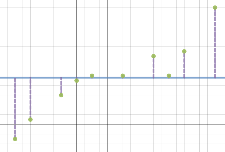
 First, we have a scatterplot with its LSRL included. Activate the “mean of x and y” folder” and notice the intersection of these value lines. Here, the points are all draggable, so we can easily generalize that all LSRL’s pass through the point x-bar, y-bar.
 The second discovery is a bit more subtle. Click the next folder, and now we have new lines 1 standard deviation in each direction for x and y. Clearly, our intersection point is no longer on the LSRL, but what is its significance? How far do we rise and run to get to this new point on the LSRL? Some calculation and discussion may help students discovery this fact about the slope of an LSRL:
![]()
This is not a fact students need to memorize in AP Stats, but certainly the discussion builds understanding of regression beyond what our calculator provides.
NORMAL APPROXIMATION OF THE BINOMIAL DISTRIBUTION
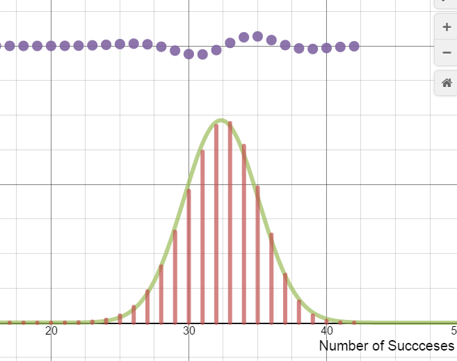 Lists on Desmos have strong potential for investigating a distribution by using a formula repeatedly. In this Desmos demonstration, students investigate the behavior of the binomial distribution, using sliders to define values for n and p in the distribution. Activating the normal curve folder allows us to assess the “fit” of the binomial distribution against a normal curve. I added the purple dots near the top to make it easier to investigate where the normal approximation is strong/weak in approximating its binomial cousin.
While Desmos has a while to go before it will replace graphing calculators in my AP Stats class, these activities will be part of my classroom this year. Looking forward to creating and sharing more!

3 replies on “Desmos Lessons for AP Statistics”
Hi Bob,
I’m really intrigued with using Desmos as a demonstrator of AP Stats concepts and I am very excited to try some of your shared documents. I was playing with your Explaining r-squared document as you suggested…and I can’t seem to drag the points around. Maybe I’m missing small Desmos technique? Or I misunderstood your invitation to play? Could you help? Thanks so much for sharing!!
wow, those points don’t drag…my bad. I think I have fixed it now. Take a try with this updated one: https://www.desmos.com/calculator/29hfte7c1u
Wow! I think the normal approximation to the binomial is an awesome visualization! I will definitely share this with my students and other teachers I work with!