Categories
Algebra Class Openers Statistics

Class Opener – Day 38 – Are Any of My Students Compatible?

Today’s opener was inspired by a movie correlations activity I have used in AP Statistics, and Cathy Yenca’s awesome activity which brings this idea down to the Algebra level.

For my freshman class, I wanted to students to “discover” the role of the correlation coefficient r – how it acts as a measure of the strength of the relationship between two quantitative variables.  To begin, 10 potential vacation / off-day activities were listed on the board:

  • Ski
  • Go to Beach
  • Amusement Park
  • Baseball Game
  • Broadway Show
  • Camping
  • Washington DC Tour
  • Shopping Day
  • Big Concert
  • Cruise

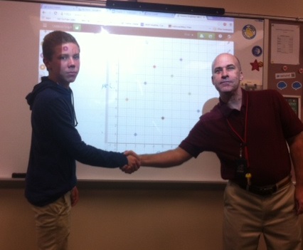
Students were each asked to rank these activities from 1 to 10 (10 being most desirable) and using each number only once. The class then moved into partnerships with my suggestion that they work with someone they maybe did not know so well in class, and compared results.  With an odd number of students, I worked with a student to share interests.  Results for each activity were plotted as ordered pairs, with each partner contributing their number score.  Students plotted their points on graph paper, while my student partner and I used Desmos – and quickly discovered that we have little in common.

Colin

gallery
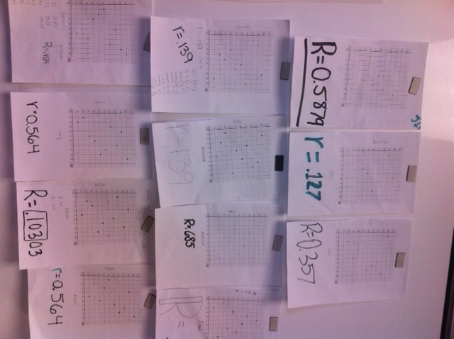
From there, students learned how to use graphing calculators to analyze the data – making the scatterplot and finding the best-fit line.  The partnerships also wrote this mysterious new statistic – r – on the bottom of the graph and shared their graph in the board.  Through a gallery walk, the class examined the graphs and tried to conjecture the meaning of r.

This worked better than planned, as the class quickly made some key observations:

  • Pairs with stronger relationships have “higher” r values.
  • There are no r-values greater than 1.
  • r can be negative if people answer opposite each other.

Definitely will add this activity to my arsenal every year!


If you are interested in the activity for AP Stats, you can check out the Google Form we use, then some instructions for processing the data in this video:

Categories
Class Openers Statistics

Class Opener – Day 37 – Random Sampling

We’re into the home stretch of our stats unit and I am looking to reflect upon our study of the normal distribution, yet look ahead at what’s to come – sampling and margin of error.  The Rossman-Chance Applets provide some meaningful, interactive discussion starters in statistics.  Today, as students entered, the Reeses Pieces sampling applet was drawing random samples of size 25 – displaying the results in a dotplot.  Little by little, the dotplot took shape as more samples were drawn…until, eventually, an old friend made an appearance….

reeses

Hey, that’s the Normal Distribution!  Why yes, yes it is…..isn’t it great that random samping reveals such a powerful statistical concept?

But that’s not all.  With election day approaching next week, we can start to build connections between random sampling, the normal distribution, and political polling.  The parallels are strong, and we’ll talk about them within the next week.

  • With sampling candy, there is a pre-existing proportion of “orange” candy.  In a voting population, there is an existing proportion of people who will vote for a certain candidate.
  • With candy, we can draw a random sample of candies. For a poll, we contact a random sample of potential voters.
  • When we sample candy, sometimes we might get 50% orange, or 45 % orange, or 60% orange – variability is part of the game. In political polling, we try to estimate the poroportion who will vote for a candidate, and we hope to get close to the target. Margin of error gives us an idea of how close we are.

There are many other interesting discussions to be had surrounding the applets – try some with your classes. They aren’t just for AP kids!

Categories
Class Openers Statistics

Class Opener – Day 36 – Introverts vs Extroverts

We’re about half-way through a basic stats unit in my 9th grade class, with a quiz tomorrow on standard deviation and the normal distribution.  I need one last class example to have students compare and contrast data sets by looking at their centers and variability.  A morning brainstorm turned into a fun exploration of my students’ personalities.  3 groupings were shown my back whiteboard:

  • EXTROVERTS
  • MIDDLE
  • INTROVERTS

After a brief discussion of what it means to be introverted or extroverted, and doing my best to steer discussion away from any negative connotations, I asked students to self-identify and move to a corner of the room based on where they see themselves.  To clean up things some, I told them to arrange themselves so that we had exactly 8 introverts and 8 extroverts, with everyone else in the middle.  Some adjusting then took place, as we agreed on who belonged in which group.

Now for the data collection aspect.  I had each student approach the back board and write their signature in the appropriate column.  This is where the fun began – as my introverts calmly waited for their peers to write their names and move away, the extroverts fought over markers and board space.  As students sat down after contrubiting their signature, some noticed immediately what was happening :

classdata

After all names were written, and we had a good laugh over the clear differences in the categories, we needed some data.  Each student approached the board and measured the height of a name at its tallest point, recording to the nearest tenth of a centimeter.  Tonight’s homework is then to compute the standard devation “by hand” for one of the groups, and comment on differences.  My old friend the Nspire App is helpful here to show the clear difference between the introverts and the extroverts:

graphsUsing authentic data in class matters, as kids more readily discuss what they see and are generally more eager to dig deeper into a problem.  This was a fun way to culminate the first half of our stats unit.