Categories
Uncategorized

Class Opener – Day 48 – Can My Students Apply New Ideas?

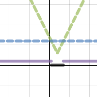
Yesterday’s class featured a discussion of absolute value inequalities, and using Desmos to explore problems through graphs. I knew that not all students were totally on board with this method for comparing two functions, but I felt confident that many in the class could now analyze an inequality problem using a graph.

cubic
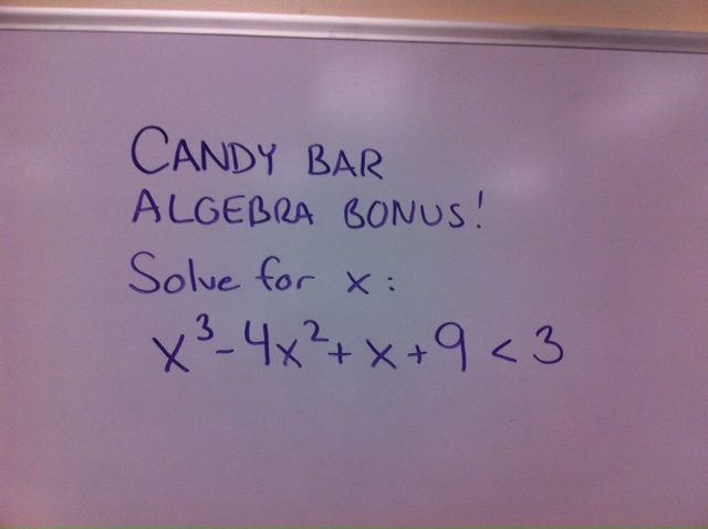
So, the problem on the board when students walked in was intended to see if yesterday’s discussion could transfer to new ideas.  Would my students now be able tackle a more difficult problem, or a problem with a similar theme from another chapter – like the polynomial problem I gave as a bonus?  Would they impress me with their ability to analyze the inequality?

Nope.

The first two hands raised to offer solutions gave close, yet incorrect answers, as they used Wolfram to “find” an answer – and incorrectly interpreted the output. Other students attempted a combination of factoring / dividing / shuffling of terms to gain some insight. But as these students have only some limited experience with quadratics, extending to the cubic was difficult.

But I’m not surprised, nor at all disappointed. My students have been trained very well in algebra as mechanical steps. The idea that we can analyze a scenario by looking at its graph is much more foreign to them. I only hope that I have started to chip away a bit and get them thinking about multiple perspectives.  And by the end of class, I finally noticed some students toying with Desmos and looking at the given cubic.  Tomorrow I’ll help them cross that bridge.

Categories
Algebra Class Openers

Class Opener – Day 47 – Visualizing Absolute Value Inequalities

We’re moving through our algebra review, and today is absolute value day! I’m not sure the students are as thrilled about this as I am –

absolute value

My students have seen absolute value equations and inequalities before, mostly as a stand-alone unit with a series of special rules to memorize. But I find that students have rarely been asked to think about solutions to inequalities as the comparison of values between two functions. So instead of re-hashing some old rules, let’s fire up the netbooks and look at some graphs!

The Desmos desmonstration here (it’s clickable) allows students to experiment with the parameters of an absolute value function, and compare to a constant function.  Before diving into some specific problems, I allowed a few minutes for partnerships to play and try to summarize any relationships they saw.  Very few saw an immediate link to what we have already been working on – inequalities – and the best was yet to come.

To start thinking about specific inequalitiy problems, I asked students to set the sliders so that they represent the following problem:

The graph then lets us analyze the relationship between the absolute value function (dashed green) and the constant function (dashed blue).

absolute graph

Time to find out if my students see the link between the graphs and the inequality. Groups were given 2 minutes of “table talk” to discuss:

How does this graph allow us to find solutions to the given inequality?

This was not a quick discussion. Many students were eager to participate and provide ideas, but many went back to pencil and paper, rather than analyze the graph.  Soon, with some students approaching the board, links beween the green and blue functions were found.  But, if scaffolding is needed, think about these prompts:

  • When is the green “above” the blue? What does this indicate?
  • When is the green “below” the blue? What does this indicate?
  • Where do the green and blue intersect?

Finally, students began to understand the meaning of the black and purple lines on the graph – representations of the “greater than” and “less than” solutions sets.

In the end, I find that using technology to analyze the visual relationships between functions allows for a deeper understanding than algebraic maniupulation alone. Yet, I am often surprised when students don’t know that this is a valid (not “cheating” or somehow dirty) method of solving an equation. To assess what parts of this lesson “stuck”, I plan to give the following opener tomorrow.  Solve for x:

Wondering how many will immediately whip out Desmos on their cell phone….hoping they do!

Categories
Class Openers Statistics

Class Opener – Day 46 – Correlation Does NOT Mean Causation!

Today’s class opener comes from my Advanced Placement Statistics class, but provides an important lesson for stats students of all ages.  A timeplot featuring two interesting data sets, and their changes over time is featured as students enter:

correlation-does-not-imply-causation

That’s quite a high r value we have for two variables, autism diagnoses and organic food sales, which would not seem so closely related. In conversation with the class we discussed the importance of clear communication, and how this article could easily be summarized and misinterpreted by our local newspaper:

ORGANIC FOOD CAUSES AUTISM, RESEARCH SHOWS

Uh oh….we have a problem.  And not an uncommon problem, as scientific studies which find correlations between variables are often misinterpreted as cause-effect studies.  The fun site Spurious Correlations by Tyler Vigen provides some wild examples of variables with strong (sometimes eerliy strong) correlations to help frame discussions.  Some fun examples –

  • Divorce rate in Maine correlates with Per capita consumption of margarine (US)
  • Worldwide non-commercial space launches correlates with Sociology doctorates awarded (US)
  • Per capita consumption of chicken (US) correlates with Total US crude oil imports

Later, my students will be asked to read and respond to a “newspaper article” about a California school which analyzed their student data and found that student achievement correlates strongly to student height.  The school’s reaction to this correlation seems dubious at best, and with good reason….it’s a fictitious article I wrote symobolize the danger of seeking cause/effect from casual relationships.