Categories
Uncategorized

Making It Stick…With Beanbags

The book Making It Stick – the Science of Succesful Learning has caused me to consider how I approach practice and assessment in my math classroom. The section “Mix Up Your Practice”, in particular, provides ideas for considering why spaced practice, rather than massed practice, should be considered in all courses.

But it was an anecdote which began the chapter on spaced practice which led to an interesting experiment for stats class.  The author presents a scenario where eight-year-olds practiced tossing bean bags at a bucket.  One group practiced by tossing from 3 feet away; in the other group, tosses were made at two buckets located two feet and four feet away.  Later, all students were tested on their ability to toss at a three-foot bucket.  Surprisingly, “the kids who did best by far were those who’d practiced on two and four-foot buckets, but never on three foot buckets.”

Wow!

Let’s do it.

My colleague and I teach the same course, but on different floors of the building during different periods. Each class was given bean bags to toss, but with different practice targets to attempt to reach.

  • In my class, lines were taped on the floor 10 and 20 feet from the toss line.
  • For Mr. Kurek’s class, one target was placed 15 feet from the toss line.

Photo Oct 05, 9 33 54 AMAfter every student had a chance to practice (and some juggling of beanbags was demonstrated by the goofy….), I picked up my tape lines, and placed a new, single line 15 feet from the toss line.  Each student then took two tosses at the target, and distances were recorded (in cms).

We then analyzed the data, and compared the two groups (the green lines are the means):

bean bags

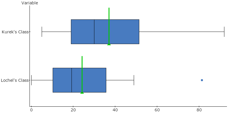
I love when a plan comes together!  The students, who did not know they were part of a secret experiment, were surprised by the results – and this led to a fun class discussion of mixed practice.  Here, the mixed practice group was associated with better performance on the tossing task. Totally a “wow” moment for the class, and a teachable moment on experimental design.

Advertisement
Categories
Middle School Statistics

Even Great Presentations Have Their Moments….

Recently, I attended a talk where the circle graph below was used to help emphasize the many online tools our students utilize.  To be fair, the presentation was otherwise fantastic, but sometimes my stats-abuse-radar is on full alert.  Use it as an opener for class discussion, and see if your students notice the inherent problem with this graph:

Photobucket

Some questions for a class discussion:

  • Does this graph portray the data accurately?
  • Is a circle graph appropriate here? Why or why not?
  • How can we re-display the same information effectively using a new circle grpah, or a different type of graph?

In moments like this, sometimes it is best to draw energy from inspirational quotes.  I leave you with this, from the Simpsons:

Hypnotist: You are all very good players
Team: We are all very good players.
Hypnotist: You will beat Shelbyville.
Team: We will beat Shelbyville.
Hypnotist: You will give 110 percent.
Team: That’s impossible no one can give more than 100 percent. By definition that’s the most any one can give.
Categories
Statistics

Explorations in Polling

Primary election season is here, and news reports are filled with sound bites from candidates, their supporters, and pundits all trying to get the edge by being the first with breaking news.  It’s also polling season, as every news organization seems to have their own poll, all designed to project the winners.  This provides a great opportunity to talk about some statistics concepts which often get buried in the high school curriculum: sampling, surveys, margin of error and confidence intervals.

Photobucket

One nice resource I have used in my classes before is the site pollingreport.com. This site collects polls from many sources: news agencies, university organizations and polling companies. Students can search from a long menu of topics and examine the careful wording of survey questions, time-progression data and information on sample size and margin of error.
Having students select their own survey, and interpret the results, can lead to interesting class discussions. One problem with polls is that the results are often taken as absolute, rather than an estimate of a population. An interval plot can help remedy this, and get students thinking about that pesky margin of error, which is often buried, italicized, or shown in a smaller font than the rest of a poll’s results. Here’s an example of an interval plot, using the results of a poll from pollingreport.com:

Quinnipiac University Poll. Feb. 14-20, 2012. N=1,124 Republican and Republican-leaning registered voters nationwide. Margin of error ± 2.9.
“If the Republican primary for president were being held today, and the candidates were Newt Gingrich, Mitt Romney, Rick Santorum, and Ron Paul, for whom would you vote?”

Photobucket

Some questions for discussion can then include:

  • How can these results be used?
  • What do you think would happen if we asked more people? Or if the election were held today?
  • What would it mean if intervals over-lapped each other?
  • How likely is it that nation-wide support for Rick Santorum is within the interval?

While confidence intervals don’t need to be defined formally, the concept of these intervals indicating plausible values for the population parameter can be discussed. The New York Times, in particular, does an excellent job of providing an accessible explanation for margin of error, such as this excerpt from a telephone poll summary:

In theory, in 19 cases out of 20, overall results based on such samples will differ by no more than three percentage points in either direction from what would have been obtained by seeking to interview all American adults. For smaller subgroups, the margin of sampling error is larger. Shifts in results between polls over time also have a larger sampling error.

Next, we can take a look at formulas for margin of error. One convenient formula found in some textbooks links margin of error directly to the sample size:

By going by to pollingreport.com, and pulling a sample of polls with different sample sizes, we can examine the accuracy of this short and snappy formula.  The scatterplot below uses sample size as the independent variable, and reported margin of error as the dependent variable.
Photobucket
The formula seems to be a nice guide, and some polls clearly use more sophisticated formulas which generate more conservative margins of error.

Classes who wish to explore polling further can check out the New York Time polling blog, FiveThirtyEight, which provides more detailed analyses of polls and their historical accuracy.