If you make a Wordle of all of the year-long conversation in an AP Statistics class, the word “normal” will certainly be one of the font-size winners. Think of all of the places the word “normal” enters the conversation –
- We find the probability of events given a nomal distribution.
- We combine random variables, which may have normal distributions.
- We discuss a normal approximation for a binomial setting.
- The Central Limit Theorem allows us to assume a sampling distribution of sample means will be approximately normal if the sample size is sufficiently large.
- The sampling distribution of sample proportions will be approximately normal if the expected number of successes and failures is “large”
- We assess samples for signs of normality in their parent populations.
It’s this last bullet which if often the trickiest for students, yet the most critical when it comes to structure of hypothesis testing. Exactly what are “signs” of normaility? How can I tell if they have been met? And what is “it” that is approximately normal anyway? These are questions which come up early in Stats as we begin to look at the distribution of samples.
Here’s a diagram which makes an appearance often in my class, and provides the framework for my lesson on assessing normality:
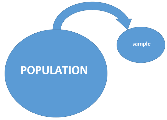
Much of what we do in statistics deals with taking a representative sample from a large population, making a conjecture about the population, then using mathematical evidence to reach a conclusion. In my class, this is our first experience with making decisions about a population based on sample evidence, and I need the language and ideas to be tight from the start. To start, I hand out a sheet with 8 different boxplots on it, and ask students to assess them. Specifically:
Based on the sample, do you feel there is evidence that the population from which it came could be approximately normal?
Groups then discuss each of the 8 graphs, and a quick show of hands is used to vote “yes” (pro-population-normailty) or no for each of the graphs. Up to now, students have had exposure with center, shape and spread ideas, the relationship betwee mean and median in a symmetric distribution, and the 68-95 rule. Conversation often centers on perceived skewness and outliers, and oberservations surrounding the centering of the median in the “box” part of the boxplot.
Now it’s time for the big reveal…..not only do all 8 of the boxplots come from populations which are approximately normal, they all are samples from the SAME population. It’s a mean trick, no doubt, but I now show students the Fathom document used to create the samples, and have the file cycle through 200 different samples. This is often eye-opening to students, as they begin to see the wide variation in samples from the same population, and hopefully causes them to cast a bigger net when looking to “assume” normailty in populations. The video below explains the procedure:
In the second half of this activity, I share 6 data sets with the class, which I have pulled from various sources. The data is linked from my class TI84 or Nspire software and sent to students. The task at hand is to assess each data set, and conjecture if the parent population can be assumed to have an approximately normal distribution. This Excel file contains the data sets, which you can format for your use.
In this activity, the goal is to determine if a given sample comes from a population that is approximately normal. By now, students have a decent grasp for what to look for:
- Mean “close” to the median
- Symmetry, perhaps a few outliers
- Rough adherence to the 68-95 rule (this is tough to actually check, but if it is checkable, we should give it a good attempt)
For now, I leave number 4 on the list blank. It will be discussed later. In addition to making a decision pro/con normality, I ask groups to conjecture about the source of each data set. The titles of the columns do provide some context clues. to the sources of the sets:
- PRICE – price of 117 homes sold in Albequerque, NM in 1993
- TEMP – high temperatures in Las Vegas in July, August 2007
- MYST – the mystery list. 100 random integers from 50-100 (from RandInt on a TI-84)
- WT – weights of adult males ages 22-30, from a clinical study
- AGE – age of CEO’s from a Forbes list of Top Companies
- BRAIN – IQ scores for 40 research subjects
As groups share their findings on the board, some important themes emerge:
- Context matters! If we consider the source of a data set, this may provide important information about its population distribution. Often, measurements from things in nature (heights, weights, lengths, IQ’s) have an approximately normal distribution. Data involving salaries and prices, meanwhile, are often skewed.
- Multiple representations are helpful. Above, the data set “IQ” has a nice, symmetric distribution if you look at its boxplot. But a dotplot reveals an important feature not evident in the boxplot – the data consists of 2 distinct groupings, with a large gap in the center.
- It’s not the sample which we are trying to prove normal, it’s the underlying population. Later, during hypothesis testing, it is common find students who caim “the sample is normal” based on a boxplot (or those who simply claim, “it’s normal”). We need to help students move away from meaningless statements like this, and towards a communicated linkage between the sample and its parent population.
- As the lesson progresses, the class begins to see that assessing normality is tricky business. We’ll be making a lot of assumptions about the behavior of populations in stats class through the year. Later, the robustness of procedures will provide a safety net if a population isn’t quite normal.
- And maybe the most important idea: it’s not so important that we clearly identify and justify populations which are normal; it’s more important that we identify populations which are clearly NOT normal.
WHAT ABOUT NORMAL PROBABILITY PLOTS?
After all 6 data sets have been evaluated and discussed, I explain the idea and structure of a normal probability plot, which becomes #4 in our list of “what to look for”. The Npsire does a nice job making them, with the z-score axis clearly labeled.
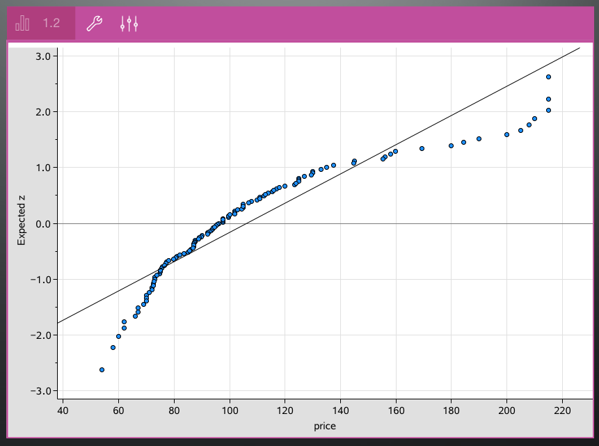
I have found that the more years I teach AP Stats, the less I stress this graph. It’s easily forgotten under the avalanche of information in the course, and the procedures described above are sufficient for the job. Unless you spend time developing the structure of this graph – why transforming percentiles to z-scores in a normal distribution yields a linear function – it becomes another disconnected idea to memorize. I show it – but then we cast it aside.

 Z-PUZZLES – CHRISTINE WOZNIAK