Categories
High School Statistics

Compute Expected Value, Pass GO, Collect $200

Photo Oct 11, 7 08 49 AM.jpgExpected Value – such a great time to talk about games, probability, and decision making!  Today’s lesson started with a Monopoly board in the center of the room. I had populated the “high end” and brown properties with houses and hotels.  Here’s the challenge:

When I play Monopoly, my strategy is often to buy and build on the cheaper properties.  This leaves me somewhat scared when I head towards the “high rent” area if my opponents built there.  It is now my turn to roll the dice.  Taking a look at the board, and assuming that my opponents own all of the houses and hotels you see, what would be the WORST square for me to be on right now?  What would be the BEST square?

For this question, we assumed that my current location is between the B&O and the Short Line Railroads.  The conversation quickly went into overdrive – students debating their ideas, talking about strategy, and also helping explain the scenario to students not as familiar with the game (thankfully, it seems our tech-savvy kids still play Monopoly!).  Many students noted not only the awfulness of landing on Park Place or Boardwalk, but also how some common sums with two dice would make landing on undesirable squares more likely.

ANALYZING THE GAME

After our initial debates, I led students through an analysis, which eventually led to the introduction of Expected Value as a useful statistic to summarize the game.  Students could start on any square they wanted, and I challenged groups to each select a different square to analyze.  Here are the steps we followed.

photo-oct-11-8-14-56-am

First, we listed all the possible sums with 2 dice, from 2 to 12.

Next, we listed the Monopoly Board space each die roll would causes us to land on (abbreviated to make it easier).

Next, we looked at the dollar “value” of each space.  For example, landing on Boardwalk with a hotel has a value of -$2,000.  For convenience, we made squares like Chance worth $0.  Luxury Tax is worth -$100.  We agreed to make Railroads worth -$100 as an average.  Landing on Go was our only profitable outcome, worth +$200. Finally, “Go to Jail” was deemed worth $0, mostly out of convenience.

Finally, we listed the probability of each roll from 2 to 12.

Now for the tricky computations.  I moved away from Monopoly for a moment to introduce a basic example to support the computation of expected value.

I roll a die – if it comes out “6” you get 10 Jolly Ranchers, otherwise, you get 1.  What’s the average number of candies I give out each roll?

This was sufficient to develop need for multiplying in our Monopoly table – multiply each value by its probability, find the sum of these and we’ll have something called Expected Value.  For each initial square, students verified their solutions and we shared them on a class Monopoly board.

photo-oct-11-8-21-37-am

The meaning of these numbers then held importance in the context of the problem – “I may land on Park Place, I may roll and hit nothing, but on average I will lose $588 from this position”.

HOMEWORK CHALLENGE: since this went so well as a lesson today, I held to the theme in providing an additional assignment:

Imagine my opponent starts on Free Parking.  I own all 3 yellow properties, but can only afford to purchase 8 houses total.  How should I arrange the houses in order to inflict the highest potential damage to my opponent?

monopoly-back-row

I’m looking forward to interesting work when we get back to school!

Note: I discussed my ideas about this topic in a previous post.  Enjoy!

Categories
Statistics

Who Assessed it Better? AP Stats Inference Edition

Free-response questions and exam information in this post freely available on the College Board – AP Statistics website

Today I am stealing a concept from Dan Meyer’s task comparison series “Who Wore it Best”, and bringing it to the AP Statistics exam world. In the series of 6 free-response questions on the AP Stats exam, it is not unusual for one question to focus solely on inference. Compare these two questions, which each deal with inference for proportions.

From 2012:

2012q

From 2016:

2016q

I read (graded) the question from 2012 as an AP Exam reader, and observed a variety of approaches. I find that while many students understand the structure of a hypothesis test, it’s the nuance – the rationales for steps – which are often lost in the communication. In the 2012 question, students were expected to do the following:

  1. Identify appropriate parameters
  2. State null and alternate hypotheses
  3. Identify conditions
    • Independent, random samples and normality of sampling distribution
  4. Name the correct hypothesis procedure
  5. Compute / communicate test statistic and p-value
  6. Compare the p-value to an alpha level
  7. Make an appropriate conclusion in context of the problem

It’s quite a list.  And given that individual AP exam problems are worth a total of 4 points, steps are often combined into one scoring element.  Here, naming the test and checking conditions were bundled – as such, precision in providing a rationale for conditions was often forgiven.  For example, if students identified the large sample sizes as a necessary condition, this was sufficient, even if there was no recognition of a link to normality of sampling distributions.  Understanding the structure of a hypothesis test – with appropriate communication – was clearly the star of the show.  While inference is one the “big ideas” in AP Statistics, my view is that questions like this from 2012 encourage cookbook statistics, where memorized structure take the place of deeper understanding.

So, it was with much excitement that I saw question 5 from 2016.  Here, the interpretation of a confidence interval was preserved. But I appreciate the work of the test development committee in parts b and c; rather than have students simply list and confirm conditions for inference, the exam challenges students to be quite specific about their rationales. With parts b and c, students certainly struggled more than with the conditions in 2012, but I hope their inclusion causes statistics teachers to consider their approach to hypothesis conditions. The mean scores for each question speak to struggles students on this question, compared to traditional hypothesis testing structure.

  • 2012: 1.56 (out of 4)
  • 2016: 1.27 (out of 4)

The inclusion of part b of question 5 this year, where students were asked to defend the np > 10 condition, was perfect timing for my classes.  This year, I tried a new approach to help develop student understanding of the binomial distribution / sampling distribution relationship. I found that while many students will continue to resort to the “short cut” – memorizing conditions – a higher proportion of students were able to provide clear communication of this inference condition.

The AP Statistics reading features “Best Practices Night” – where classroom ideas are shared.  You can find resources from the last few years at Jason Molesky’s APStatsMonkey site. I shared my np > 10 ideas with the group, and received many positive comments about it.  Enjoy my slides here, and feel free to contact me with questions regarding this lesson:

Finally, I can’t express how wonderfully rich a professional-development experience the AP reading is.  I always find myself with a basket of new classroom ideas and contacts to share with – it’s stats-geek Christmas.  For me, 2016 is the year the #MTBoS started to make its mark at the Stats reading – I met so many folks from Twitter, and we held our first-ever tweet-up!

Also, the vibrant Philadelphia-area stats community was active as always.  We meet as a group a few times a year to share ideas and lessons; seeing so many from this area participate in the reading makes us all better with what we do for our students.


Categories
Statistics

When Binomial Distributions Appear Normal

We’re working through binomial and geometric distributions this week in AP Stats, and there are many, many seeds which get planted in this chapter which we hope will yield bumper crops down the road. In particular, normal estimates of a binomial distribution – which later become conditions in hypothesis testing – are valuable to think about now and tuck firmly into our toolkit.  This year, a Desmos exploration provided rich discussion and hopefully helped students make sense of these “rules of thumb”.

gifsmos
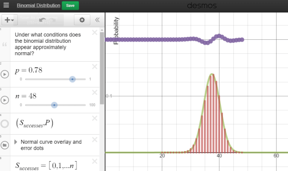
Each group was equipped with a netbook, and some students chose to use their phones. A Desmos binomial distribution explorer I had pre-made was linked on Edmodo. The explorer allows students to set the paremeters of a binomial distribution, n and p, and view the resulting probability distribution. After a few minutes of playing, I asked students what they noticed about these distributions.

A lot of them look normal.

Yup. And now the hook has been cast.  Which of these distributions “appear” normal, and under what conditions?  In their teams, students adjusted the parameters and assessed the normality.  In the expressions, the normal overlay provides a theoretical normal curve, based on the binomial mean and standard deviation, along with error dots. This provides more evidence as students debate normal-looking conditions.

bins1

Each group was then asked to summarize their findings:

  • Provide 2 settings (n and p) which provide firm normality.
  • Provide 2 settings (n and p) which provide a clearly non-normal distribution.
  • Optional: provide settings which have you “on the fence”

My student volunteer (I pay in Jolly Ranchers) recorded our “yes, it’s normal!” data, using a second Desmos parameter tracker.  What do we see in these results?

bins2.PNG

Students quickly agreed that higher sample sizes were more likely to associate with a normal approximation. Now let’s add in some clearly non-normal data dots. After a few dots were contributed, I gave an additional challenge – provide parameters with a larger sample size which seem anti-normal. Hers’s what we saw:


bins3

The discussion became quite spirited: we want larger sample sizes, but extreme p’s are problematic – we need to consider sample size and probability of success together!  Yes, we are there!  The rules of thumb for a normal approximation to a binomial had been given in a flipped video lecture given earlier, but now the interplay between sample size and probability of success was clear:

And what happens when we overlay these two inequalities over our observations?

bins4

Awesomeness!  And having our high sample sizes clearly outside of the solution region made this all the more effective.

Really looking forward to bringing this graph back when we discuss hypothesis testing for proportions.