The Chi-Squared chapter in AP Statistics provides a welcome diversion from the means and proportions tests which dominate hypothesis test conversations. After a few tweets last week about a clay die activity I use, there were many requests for this post – and I don’t like to disappoint my stats friends! I first heard of this activity from Beth Benzing, who is part of our local PASTA (Philly Area Stats Teachers) group, and who shares her many professional development sessions on her school website. I’ve added a few wrinkles, but the concept is all Beth’s.
ACTIVITY SUMMARY: students make their own clay dice, then roll their dice to assess the “fairness” of the die. The chi-squared statistic is introduced and used to assess fairness.
You’ll need to go out to your local arts and crafts store and buy a tub of air-dry clay. The day before this activity, my students took their two-sample hypothesis tests. As they completed the test, I gave each a hunk of clay and instructions to make a die – reminding them that opposite sides of a die sum to 7. Completed dice are placed on index cards with the students names and left to dry. Overnight is sufficient drying time for nice, solid dice, and the die farm was shared in a tweet, which led to some stats jealousy:
The next day, students were handed this Clay Dice worksheet to record data in our die rolling experiment.
In part 1, students rolled their die 60 times (ideal for computing expected counts), recorded their rolls and computed the chi-squared statistic by hand / formula. This was our first experience with this new statistic, and it was easy to see how larger deviations from the expected cause this statistic to grow, and also the property that chi-squared must always be postivie (or, in rare instances, zero).
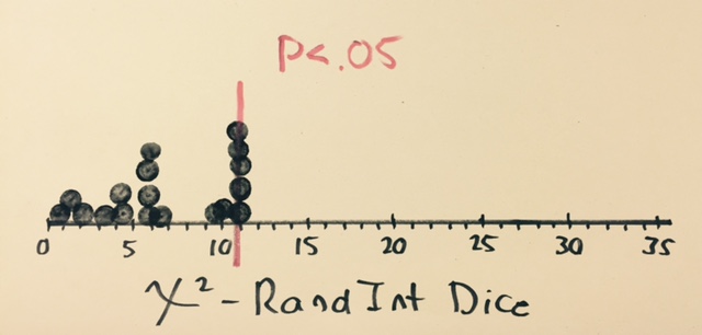
Students then contributed their chi-squared statistic to a class graph. I keep bingo daubers around my classroom to make these quick graphs. After all students shared their point, I asked students to think about how much evidence would cause one to think a die was NOT fair – just how big does that chi-squared number need to be? I was thrilled that students volunteered numbers like 11,12,13….they have generated a “feel” for significance. With 5 degrees of freedom, the critical value is 11.07, which I did not share on the graph here until afterwards.
In part 2, I wanted students to experience the same statistic through a truly “random” die. Using the RandInt feature on our calculators, students generated 60 random rolls, computed the chi-squared statistic, and shared their findings on a new dotplot. The results were striking:
In stats, variability is everywhere, and activities don’t often provide the results we hope will occur. This is one of those rare occasions where things fell nicely into place. None of the RandInt dice exceeded the critical value, and we had a number of clay dice which clearly need to go back to the die factory.
Wait..what’s this? Standard Deviation? It was my birthday this past Saturday, and the Desmos folks knew exactly what to get me as a present. Abandon all plans, it’s time to play. A lesson I picked up from Daren Starnes (of The Practice of Statistics fame) is a favorite of mine when looking at scatterplots. In the past, Fathom had been the tool of choice, but now it’s time to fly with Desmos. There are a few nuggets from AP Statistics here, and efforts to build conceptual understanding.
CORRELATION, LSRL’S AND STANDARD DEVIATION
Click the icon to the right to open a Desmos document, which contains a table of data from The Practice of Statistics. In you are playing along at home, this data set comes from page 194 of TPS5e and shows the body mess and resting metabolic rate of 12 adult female subjects. One of the points is “moveable” – find the ghosted point, give it a drag, and observe the change in the LSRL (least-squares regression line) – explore changes and think about what it means to be an “influential” point.
Next, click the “Means” folder to activate it. Here, we are given a vertical line and horizontal line, representing the means of the explanatory (x) and response (y) variables. Note the intersection of these lines. Having AP students buy into the importance of the (x-bar, y-bar) point in regression beyond a memorized fact is tricky in this unit. Drag the point, play, and hopefully we can develop the idea that this landmark point always lies on the LSRL.
Another “fact” from this unit which can easily wind up in the “just memorize it” bin is this formula which brings together slope, correlation, and standard deviation:
The formula is given on the exam, with b1 acting as the slope, so even memorizing it isn’t required, but we can develop a “feel” for the formula by looking at its components.
Click the “Means plus Std Devs” Folder and two new lines appear. we have moved one standard deviation in each direction for the x and y variables. Note that the intersection of these new lines is no longer on the LSRL. But it’s pretty close…seems like there is something going on here.
Ask students to play with the moveable point, and observe how close the rise comes to the intersection point. Can it ever reach the intersection? Can we ever over-shoot it? In the “Rise Over Run” folder, we can then verify that the slope of the LSRL can be found by taking a “rise” of one standard deviation of y, dividing by a “run” of one standard deviation of x, and multiplying by the correlation coefficient, r.
There’s other great stuff happening in the Desmos universe as well.
1. This summer brings the 4th edition of Twitter Math Camp, to be held at Harvey Mudd College in California. I’m thrilled to have latched onto a team leading a morning session on Desmos. Consider coming out for the free PD event, and join myself, Michael Fenton, Jed Butler, and Glenn Waddell for what promise to be awesome mornings. To be honest, I feel the Ringo of this crew….
2. Can’t make it to the west coast this summer? Join me at the ISTE conference in Philadelphia, where I will present a learning session: “Rethink Math Class with the Desmos Graphing Calculator“. Bring your own device and join in the fun!
3. Are you new to the world of Desmos? Michael Fenton has organized an outstanding series of challenges, with 3 difficulty levels, to help you learn by doing. Try them out – they promise to get you think about how you and your students approach relationships.
4. Merry GIFSmos everybody! The team at Desmos has developed GIFSmos to let you build your own animated gifs from Desmos files. EDIT – as Eli noted in the comments, credit for GIFSmos goes to Chris Lusto. Thanks for being so awesome, Chris!
The current chapter on expected value and combining distributions in AP Statistics is one of my favorites for a number of reasons. First, we have the opportunity to play games and analyze them…if you can’t make this fun, you are doing something wrong. Second, it often feels like the first time in the course we are doing some heavy lifting. Until now, we have discussed ideas like sampling, scatterplots and describing distributions – nothing really “new”, though we are certainly taking a much deeper dive.
The section on combining distributions contains a number of “major league” ideas; non-negotiable concepts which help build the engine for hypothesis testing later. The activity I’m sharing today will focus on these facts:
The variance of the sum of independent, random variables is the sum of their variances.
The variance of the difference of independent, random variables is the sum of their variances.
The sum of normal variables is also normal.
First, we need to have student “buy in” that variances add. Then we have the strange second fact: how can it be that we ADD variances, when we are subtracting random variables? In this activity, we’ll look at large samples, and what happens when we add and subtract these samples. Since many students taking AP Stats have the SAT on their brain, and there is a natural need to add and subtract these variables, we have a meaningful context for exploration.
SIMULATING SAT MATH AND VERBAL SCORES
The printable classroom instructions for this activity are given at the bottom of this post.
To begin, students use their graphing calculator to generate 200 simulated SAT math scores, using the “randnorm” feature on their TI calculators, and using the fact that section scores have an approximately normal distribution with mean 500 and standard deviation 110. Note – some older, non-silver edition TI-84’s won’t be happy with this, and a few students had to downgrade and use a sample of size 50 instead. There are a few issues with realism here: SAT section scores are always multiples of 10, which randnorm doesn’t “know”, and occasionally we will get a score below 200 or above 800, which are outside the possible range of scores. Also, there is a clear dependence on SAT section scores (higher math scores are associated with higher verbal scores, and vice versa), and here we are treating them independently. But since our intent is to observe behavior of distributions, and not reach conclusions about actual SAT scores, we can live with this. In my class, no student questioned this as problematic.
Repeat the simulation in another column to simulate verbal scores. Then, for both columns, compute and record the sample mean and standard deviation. For my simulated data, we have the following:
It’s time to pause and make sure all students are clear on what we are simulating. We now have 200 students with paired data – the math and verbal score for each. Like most students, our simulated students would like to know their overall score, so adding math and verbal scores is natural. I help students write this command in a new column, then let them loose with the remaining instructions on both sides of the paper.
Students had little trouble finding the sum of the math and verbal scores, and computing the summary statistics. For my sample data, we have:
As students work through this, I want to make sure they are making connections to the notes they have already taken on combining distributions. I visited each student group (my students sit in groups of 4) to discuss their findings. Most groups could quickly identify that the means add, but what about those standard deviations? By now, if my students have taken good notes, they know that standard deviations don’t add, and that variances should. I leave groups with the task of verifying that the variances add.
Here’s the beautiful thing: students who immediately tell me that they “checked” the variances and verified the addition get the evil eye from me. In this simuation, students should find that the variances are “close” to adding, but not quite. At the end of the acitivity, I ask students to conjecture why the addition is a “not quite” – even after I have beat into them that variances add. There are two main reasons for this, and I was happy that a number of students sniffed these out.
We are dealing with samples, not populations. There is inherent variability in the samples which causes the sample variances to not behave nicely.
Variances add – but only if distributions are independent. Here, even though we created large random samples, there is still some small dependence. And while we don’t specifically cover the formula for dependent distributions in AP Stats, it’s worth discussing.
Next, it’s time to look at the differences. Here’s students are asked to subtract math and verbal scores, compute the summary statistics, and compare the sum and differences. This was a nice way to go back and re-visit center, shape and spread.
CENTER: Sums are centered around 1000, while differences are centered around zero.
SHAPE: Both distributions appear approximately normal.
SPREAD: The sum and difference distributions appear to have similar variability.
And this idea that the spread, and standard deviation, will be similar for both the sum and difference, can be also be explained by looking at the range of each population distribution.
For the sums, the max score is 1600 (800 M and 800 V), with a min of 400 (200 each)
For the differences, the max score is +600 (800M and 200 V), with a min of -600 (200M and 800 V).
Here, we can see that both distributiuons has the same range.
From start to finish, this exploration took about 30-40 minutes, and was worthwhile for verifying and developing understanding of the facts for combining distributions. The student instructions and video notes students take beforehand are given below. Enjoy!
 You’ll need to go out to your local arts and crafts store and buy a tub of air-dry clay. The day before this activity, my students took their two-sample hypothesis tests. As they completed the test, I gave each a hunk of clay and instructions to make a die – reminding them that opposite sides of a die sum to 7. Completed dice are placed on index cards with the students names and left to dry. Overnight is sufficient drying time for nice, solid dice, and the die farm was shared in a tweet, which led to some stats jealousy: